|
Coupon format grid |
  

|
Navigation: Loans > Loan Screens > Coupon Format Setup Screen >
Coupon format grid
|
Coupon format grid |
|
Use this grid to design the layout of the coupon being created/edited. The size of this grid is dependent on the values entered in the Width and Height fields. A background image will appear in this grid if an image has been selected in the Image Path field.
Place label fields in this grid by selecting them in the Available Print Field Labels list view and dragging them into the grid. Additionally, user-defined text can be entered in the User-Defined Text field and dragged into the grid. If your institution wants a "Payoff Due" message to appear on the final coupon sent to the customer, the coupon format must include an Amount Due (PMTDUE) field (selected in the Available Print Field Labels list view).
Coupons can be printed from the Loans > Account Information > Additional Loan Fields and Loans > Marketing and Collections screens. Institution Option SCPB must be enabled for the coupon printing feature to be available.
Controls
The boxes in this grid that represent label fields are called controls. Some controls have a text attribute that can be altered. Controls with small gray triangles in the corners can be re-sized. Any control can be moved to any location on the grid. Click on a control to select it (and change its background color to red). You can click and drag a selection box to select multiple controls at once.
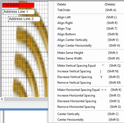
Right-Click Menu
When multiple controls are highlighted, the control with a red background is designated as the primary control. After selecting multiple controls, right-click in any empty space on the grid to open a pop-up menu of options pertaining to multiple controls. From this pop-up menu, the following options can be adjusted:
•TabOrder: Click here to set the tab key order for label fields on this screen. Click the first control to set its tab order to "1." As you click each subsequent field, the next tab number is entered automatically. The tab order can be viewed by clicking <Tab Order>.
•Align: Use these options to line up the selected controls in relation to the primary control. Controls can be aligned along the left edge, right edge, top edge, bottom edge, or centered (vertically or horizontally).
•Make Same Height/Width: Use these options to match the selected controls to the size of the primary control.
•Vertical/Horizontal Spacing: Use these options to adjust the spacing between selected controls.
Right-click on a control to open the Sizeable Label Properties dialog, which allows you to view and edit attributes of the control.