Sizeable Label Properties dialog |
  

|
Navigation: Loans > Loan Screens > Coupon Format Setup Screen > Coupon format grid >
Sizeable Label Properties dialog |
|
Right-click a control in the Coupon format grid to open this screen, which allows you to view and edit attributes of the control.
The layout of this screen will change slightly for each type of control.
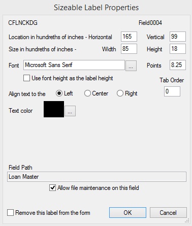
Amount and Numeric Fields
Most fields fit into the category of Amount and Numeric fields.
The control's field mnemonic and field number are displayed at the top of the screen. Other fields on the screen are as follows:
•Location in hundredths of inches – The location of the upper left-hand corner of the control.
•Size in hundredths of inches – The size of the control.
•Font and Points – The font and size of text for the control.
•Use font height as the label height – Use this field to indicate whether a control's label will automatically set its height to match the font used to display the text.
•Align text to the Left, Center, or Right – Use these radio buttons to indicate where the control's text should align.
•Text Color – The color of the control's text.
•Tab Order – The tab order of the control. Tab orders are explained on the Coupon format grid help page.
•Remove this label from the form – Use this field to indicate whether the selected control should be deleted from the grid.
Date Fields
The fields on this screen for Date controls are very limited. They include the field name and number, location, size, and Remove this label from the form (see above).
Group Boxes
Group boxes are used to organize fields on a screen into field groups. Most of the fields on this screen for Group Box controls are the same as that of Amount and Numeric controls (see above) except for the additional Group Box Heading field, which is used to indicate the text that will be displayed at the top of the field group.
Text and Labels
Most of the fields on this screen for Text and Label controls are the same as that of Amount and Numeric controls (see above) except for the additional Text for Label field, which is used to indicate the text that will be displayed for the text box or label.
Checkboxes
Checkbox fields are simple on/off fields. Most of the fields on this screen for Checkbox controls are the same as that of Amount and Numeric controls (see above) except for the following considerations:
•The Text Color field is invalid.
•The Text on Left field indicates which side of the checkbox the Text for Checkbox will be on.
•The No Text on Checkbox field indicates whether a checkbox field will be displayed on the custom screen with no associated text attached to it.
•The Text for Checkbox field indicates the text that will be displayed for the checkbox.